


 Reply With Quote
NO!
 Hall Of Fame
I ve been meaning to post this for ages and it can be quite a contentious topic.....but it doesn't have to be......you either think YES or NO!
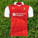
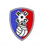
I think,and have thought for years,that the club crest is totally outdated.It should have been re designed when we moved to the NYS in 2012. It looks like we used the winning design from a Primary School competition in 1975!
Discuss!
 Moderator
NO!
 Hall Of Fame
What would you like to see the new design to look like ?
I dont have a problem with the one we have but I wouldnt rule it out depending on the new design.
Nothing wrong with simple
Hall Of Fame
In a word NO
But .......... The town crest looked good on the shirt on the first season @ NYS
Hall Of Fame
Leave it well alone
 Moderator
I do like the old one. Then there was the more prescriptive on the outline of the windmill.
I think the dubbed down one that we have now is ok.
Can't really think of anything I'd like to replace it with. It'll still look good in years to come.

 Hall Of Fame
Infiltrator.
 Hall Of Fame
How about treating yourself to one of these James
https://www.themillers.co.uk/news/20...bespoke-order/
Moderator
Don't want to see a Burnley or Barnsley type town crest on our shirt, our windmill is symbolic of us being the 'MILLERS'
Hall Of Fame
When our crest is amalgamated with a host of others on TV or on the net it stands out a mile.
Instantly recognisable and also on official merchandise so when we are walking around Meadowhall or Madrid everyone knows we're blessed with supporting the Millers
As others have said leave well alone. Love it
 Posting Permissions